PAINTED BOOKSHELVES
Whether they are built in or free standing, the back of your bookshelves can provide a great surface for colour. Chose a colour that highlights the colour scheme of the room or pick something wildly different to create a dramatic ‘pop’ of colour. Either way, the back of your bookshelves shouldn’t be ignored!
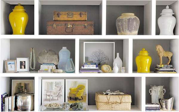
The easiest way to incorporate this look is to just paint the back of the walls, keeping the shelves untouched. If you are using this look to create a feature wall then make sure your ornaments are kept relatively sparse, have clean silhouettes and don’t clash in colour.
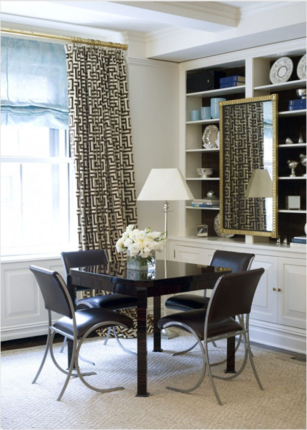
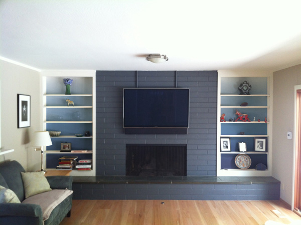
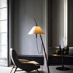
Whilst bookshelves can be used as a type of feature wall on their own, they can also be used to highlight furniture in the room. In the image below, the dark backing of the shelves effectively highlights the chairs and table and effectively draws the whole colour scheme together.
If you want something dramatic, use a different colour to the surrounding walls.
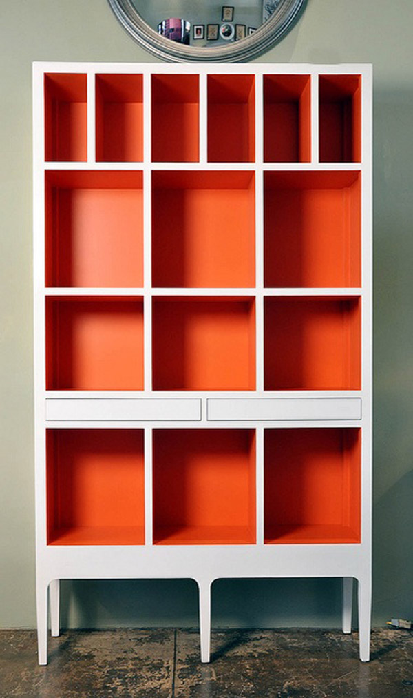
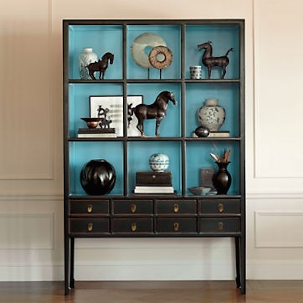
Painted bookshelf backs work just as well on freestanding pieces such as on the cabinet below. However if you’re painting them yourself, it can often be easier to paint all surfaces bar the front face. This can then be touched up with a roller later to ensure a cleaner, geometric look. I particularly love this orange colour choice below.
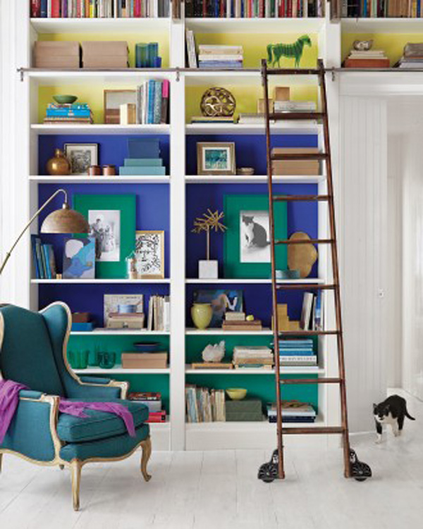
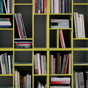
If you’re feeling a bit braver, why not try a bit of colour blocking. This look will look the most effective if you do the following as below
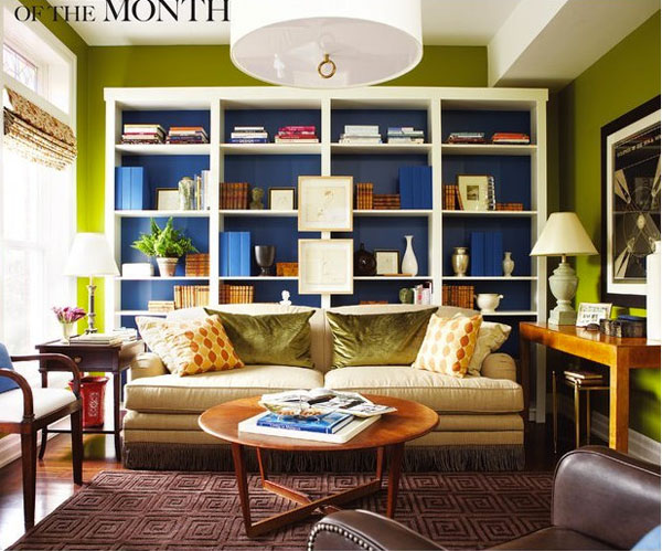
- Take one item of colour in the room that you want to highlight. In this case below it is the chair.
- Pick two harmonious colours either side of the colour of the chair. A dark blue and an aqua have been used here which nicely highlight the different hues of the chair.
- For an fun look, pick a third colour which is complementary such as the yellow (orange would work nicely too). This will help brighten up the vibe of the whole room.
If you’re not quite ready for such a bright look, why not try an ombre palette? Gradating your primary shade from dark to light as below will help add some visual interest without being too shocking. I really love this look and would love to see it on a much larger bookcase, especially around a staircase.
Im not entirely sure whether the shelves below are actually ombre or whether it’s just the light but nevertheless, if you’re going for a more neutral colour scheme, a subtle look like this would look fab.
If you’re not quite feeling brave enough to tackle the built in’s then a free standing piece is always a great place to start. Glass fronted cabinets look particularly good with a coloured back and really help showcase your items.
Reply
You must be logged in to post a comment.